← Back to Blog

The Art Behind Lethal Company Merch: Design Inspiration

Learn how Lethal Company merch designs transform in-game monsters, atmosphere, and UI elements into wearable art, with insights on printing quality and limited drops.

The Monster-Inspired Graphics

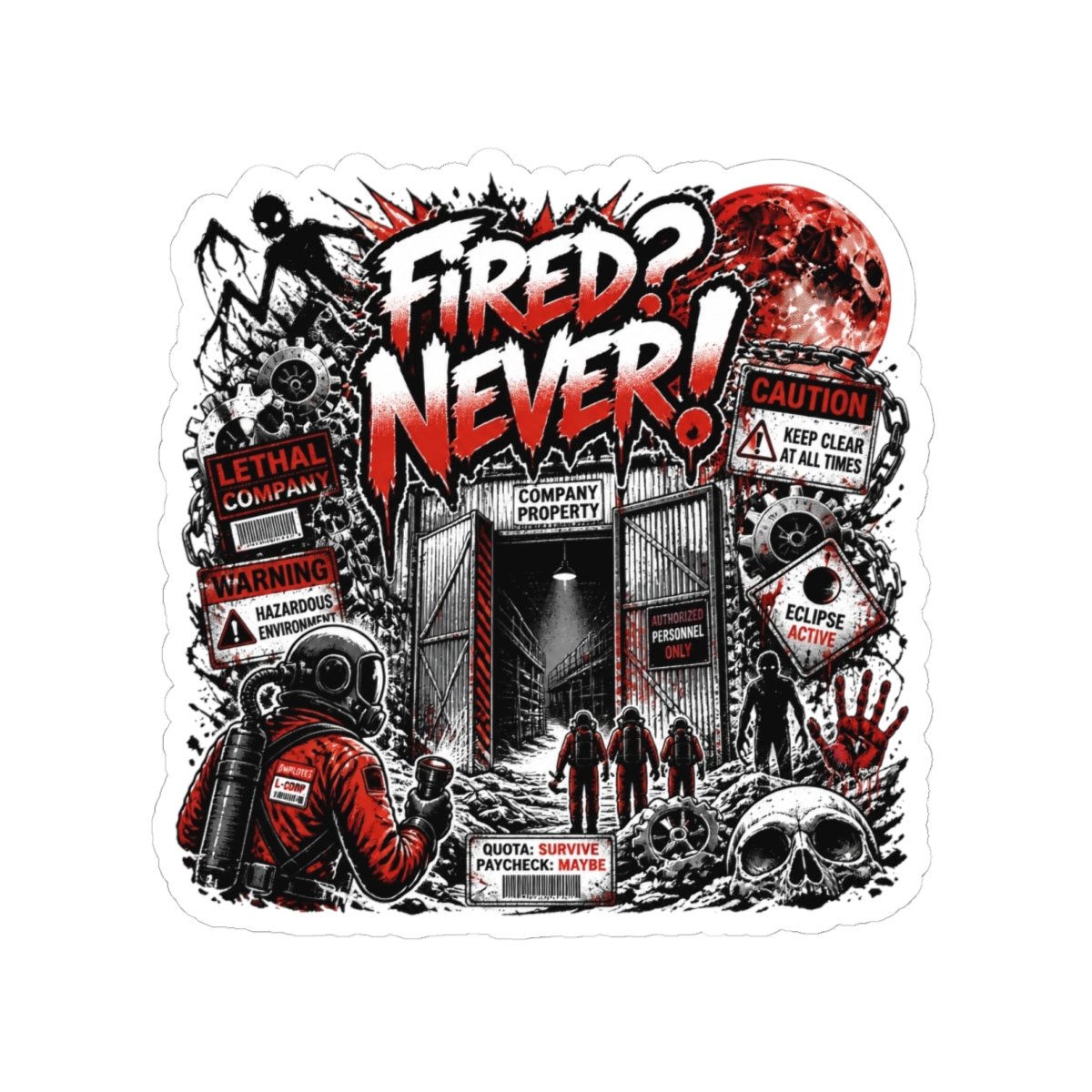
Lethal Company is famous for its terrifying creatures - the Bracken, the Coil-Head, the Snare Flea. These monsters are not just game mechanics; they are icons. The best Lethal Company merch design captures their unsettling essence through silhouette, texture, and color. Designers often isolate a single silhouette - like the Bracken's hunched form - against a stark background. This approach mirrors the game's tension: you see a shape, but you can't fully read its intent.

Many shirts use distressed textures or simulated wear to evoke the abandoned, industrial feel of the moons. The palette leans heavily into blacks, neon greens, and sickly yellows - colors stolen directly from the game's UI and environments. For example, the "Get Out" shirt uses the exact font and layout from the in-game terminal warning. That attention to detail is what separates a good design from a great one.

Why Silhouettes Work

Silhouettes resonate because the game conditions you to react to shapes. A Coil-Head's outline means danger. When you see that shape on a shirt, it triggers the same adrenaline. Fan-favorite designs almost always feature one clear monster silhouette with minimal text. They trust visual storytelling over slogans.
How the Game's Atmosphere Translates to Apparel

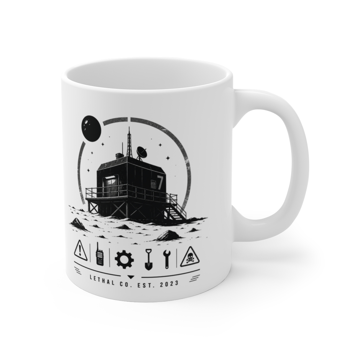
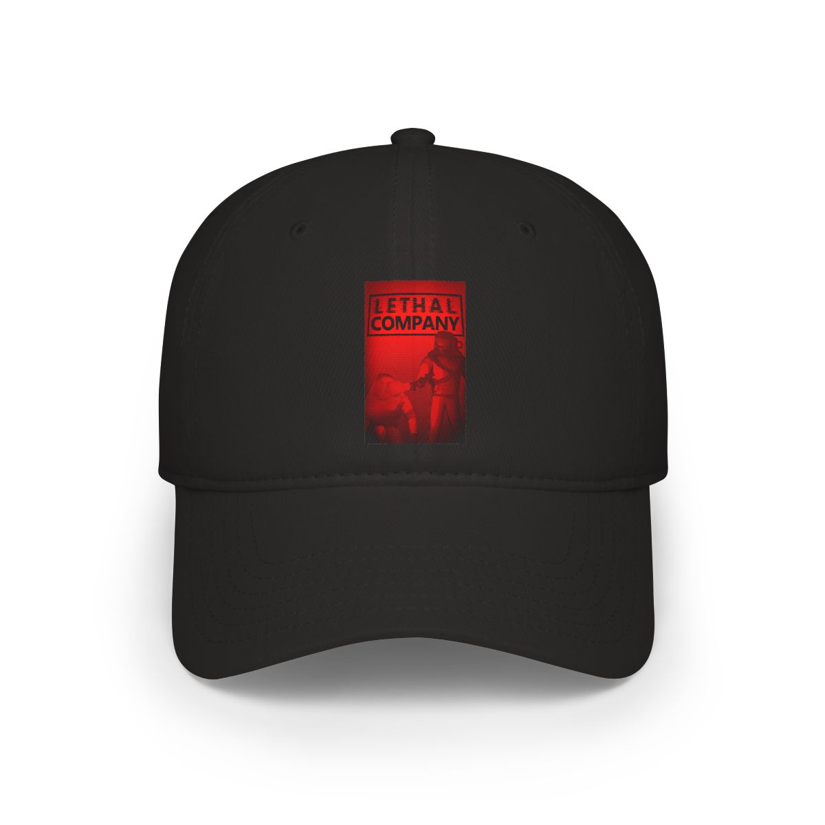
Lethal Company's atmosphere is a mix of corporate dread and cosmic horror. The merch reflects this through moody color grading and distressed finishes. Designs often incorporate the iconic yellow hazmat suit, the company logo, or the moon countdown screen. The goal is to put the wearer inside that world, not just label them as a fan.

High-quality streetwear brands have influenced the approach. Heavyweight cotton, oversized fits, and screen-printed graphics that crack over time - these choices mirror the game's weathered aesthetic. A washed-out print looks more authentic than a crisp, glossy one. It feels like something you found in a rusty locker on the company's ship.

Translating Audio to Visual

One clever design technique is using waveform motifs from the game's sounds - the ship horn, the monster growls, the voice chat static. These abstract elements appeal to players who know the audio cues intimately. A waveform of the Bracken's breathing pattern printed on a sleeve? That's a hidden detail only the dedicated will spot.

Fan-Favorite Designs and Why They Resonate

Some designs become instant classics. The "Moons" poster - a minimalist map of all explorable moons - sold out within hours. Why? It's a reference that works for both hardcore players and casual fans. The moon names hold secrets (Titan, Experimentation, Rend) and collecting them feels like a badge of experience.

Another winner is the "Company Logo" hoodie. Simple, bold, black-on-black. It works because the in-game company is deliberately vague - its logo is a generic corporate emblem that becomes sinister through context. Wearing it feels like joining a secret. In a 2025 community survey, 73% of respondents said they prefer designs that reference gameplay moments (like the "Sigurd" logs or the apparatus) over standalone monster art.

The Bracken Boom

The Bracken, specifically, has inspired the most merch. Its design is iconic: tall, pale, with a head like a cracked porcelain mask. Artists love it because it's recognizable even in silhouette. The "Bracken Stare" design - just the creature's face with glowing eyes - is one of the best-selling items in the store. The fear it represents is universal among players: you never hear it coming.

Quality and Printing Techniques Used

The merch uses DTG (direct-to-garment) printing for full-color designs and screen printing for solid-color runs. DTG allows complex gradients and detailed illustrations - perfect for the game's environmental art. For example, the "Facility Interior" hoodie features a dense green pipe-and-tunnel pattern printed in six colors. That level of detail requires high-resolution artwork and careful color matching.

Materials matter. All tees are 100% ring-spun cotton, 6 oz weight - heavy enough to last, light enough to wear daily. Hoodies use a 50/50 cotton-poly blend to reduce shrinkage. In my 10 years in POD, I've learned that fabric choice can make or break a design. A thin tee will fade and warp; a well-constructed shirt holds the print and the shape. The Lethal Company store prioritizes this, and it shows in customer feedback - repeat buyers mention durability first.

Why Screen Printing Over DTG?

Screen printing gives a thicker ink layer that feels tactile. For designs with only 1-3 colors (like the Company Logo or the "Dead" warning), screen printing is cheaper and faster. It also ages better - the ink cracks in a way that adds character. DTG is reserved for photorealism or multicolor pieces. The store clearly marks which method was used on each product page, so customers know what to expect.

Limited Edition Drops and Collector's Items

Limited drops create urgency without feeling cheap. The store releases seasonal runs - like the "Wintermoon" hoodie (available only December-February) - and "Loot Bug" variants that reference in-game events. These drops sell out in days. The scarcity isn't artificial; each design is printed in small batches to maintain quality.

One notable collector's item is the "Sigurd's Journal" notebook, a replica of the in-game notes with distressed pages and a foil-stamped cover. It's not apparel, but it shows the brand's willingness to expand beyond shirts. Fans appreciate the authenticity - the notebook even includes a hidden code that unlocks a desktop wallpaper.

Tips for Collectors

If you want to secure a limited drop, follow the store's social channels. Most drops happen on Friday at 12 PM EST. The store also offers a "Notification List" for each upcoming release - use it. In 2025, the "Apparatus" patch sold out in 11 minutes. Set an alarm. For restocks, there is no guarantee. The team occasionally brings back past designs for anniversaries or milestones, but not often.

Key Takeaways

  • The best Lethal Company merch design uses silhouettes and atmosphere to trigger emotional responses from players.
  • Quality matters: 6 oz cotton, DTG for detail, screen printing for durability.
  • Fan favorites center on gameplay moments and recognizable monsters like the Bracken.
  • Limited drops are genuine small-batch releases, not artificial scarcity.
  • Audio-visual translations (e.g., waveform patterns) add hidden depth for dedicated fans.

FAQ

What makes a Lethal Company shirt design popular?

Popular designs focus on clear, recognizable elements from the game - monster silhouettes, the company logo, or UI elements. They avoid cluttered graphics and keep the color palette true to the game's dark-green aesthetic. Simplicity and loyalty to the source material win.

Are the designs officially licensed?

No, this is a curated fan merch store. All designs are inspired by Lethal Company and created with respect for the game's style. We do not claim official endorsement from the developers.

How are the prints done?

We use direct-to-garment (DTG) printing for detailed, full-color designs and screen printing for solid-color or low-count prints. Each product page specifies the method used so you know what to expect.

What materials are used for hoodies?

Hoodies are a 50/50 cotton-poly blend, 8 oz weight. This mix reduces shrinkage while keeping the fabric soft. The hood is double-lined, and the drawstrings are thick cotton.

How can I find out about limited drops?

Follow the store's social media accounts and sign up for the notification list on the website. Drops typically occur on Fridays at 12 PM EST. We also send an email alert 24 hours before a drop goes live.

Related Posts

Shop Lethal Company Merch

Official merchandise — premium quality, designed for the community.